FedEx logo design critique
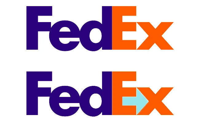
A closer look at this iconic logo reveals that the negative space between the ‘e’ and the ‘x’ creates an arrow.
If you haven’t seen it before you have now. Designed by Lindon Leader at Landor Associates in 1994, it has won over 40 awards worldwide and was ranked by Rolling Stone as one of the eight best logos of the past thirty-five years.

But not everyone is a fan of its visual trickery. Paul Rand the legendary American designer – best known for his corporate logo designs for IBM, ABC and UPS – didn’t rate it. In fact he used it as an example of a flawed design and tested his students on ways to improve it.
For Rand the biggest problem was the use of the subliminal arrow.
The arrow in the logo was a great idea, but it becomes part of the background, so you don’t even see it. So obviously the easiest thing to do is to make it blue in this context; just make it blue. Now I cannot imagine that someone didn’t try this. I just cannot imagine that, but it is possible, people avoid the obvious.
I have to disagree with Rand. Changing the colour of the arrow so that it stands out enables the qualities of an arrow – speed, precision and momentum – to be immediately associated with FedEx.
But by making the arrow obvious it removes the logo’s real strength. This lies, not in the arrow itself and the attributes associated with it, but in that the arrow created by the negative space is a hidden bonus.
You may have already seen the logo a 100 times without seeing the arrow, but once it is revealed you cannot not see it; your eye is drawn to it. The experience of surprise and the emotions tied to seeing it for the first time create a lasting impression. This increases the memorability of the logo and amplifies any attributes, associated with an arrow, to the brand.
A more visible arrow may increase the appropriateness of the logo and show off the cleverness in its design, but as a graphic device an arrow in itself is neither particularly unique nor strategic. What elevates this logo to being a great piece of design is that the designer – and the client –resisted the temptation to show off and had the confidence to avoid the obvious.