Marsden
Skills Update had a impressive reputation as a proven, innovative, high-quality educational provider and wanted to offer a new service aimed at international students.
While Marsden would represent all of the attributes and enjoy the heritage of its parent, it needed to establish an identity in its own right and potentially become the flagship brand for the group.
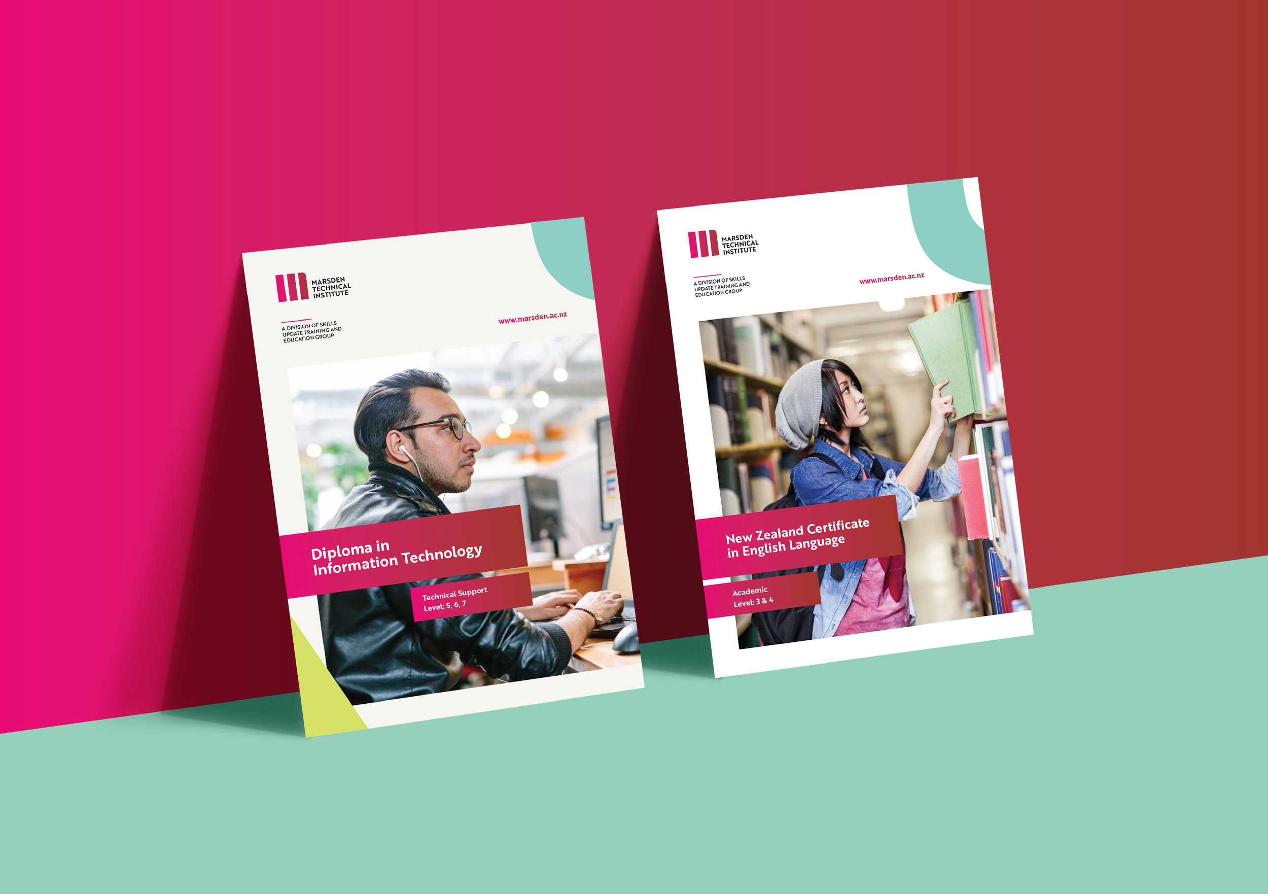
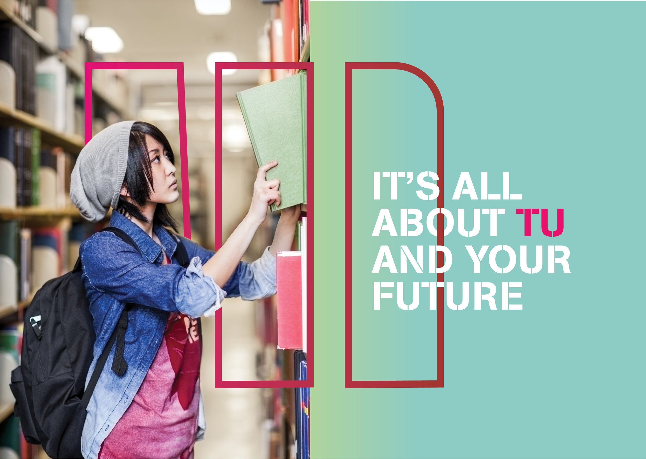
Integrity, Experience and Quality were the foundations on which the institution was built. These attributes were expressed as simple shapes to create the graphic ‘M’, a graphic icon that was heroic and solid in tone and suggestive of a trusted and enduring educational faculty. The logo lock up features the full name Marsden Technical Institute.
The extended visual system - language, graphics and colour - differentiated the brand from other providers and reflected the vibrancy and energy of Marsden and the diversity of its students. The result is a youthful, crisp, fresh tone, which attracts young people.
Hei konā mai
Services
Strategy
Naming
Branding
Communication
Copywriting
Digital
Environmental
Promotional
Photography
Social
Motion Graphics